Hiiro
Designing a marathon training app for non-runners
Deliverabels
Team
4 co-founders
2 designers
6 software engineers
My roles
Co-founder
Product designer
Design lead
Tools
Figma
Xcode
Play
Spline
Rive
TL;DR
Hiiro is a marathon-first running app that turns a high-stakes, long-term goal into a guided system. An adaptive training plan delivered into tailor-made Apple Watch app while plan continuously adjusts and 24/7 AI coach helps inside of an iOS app. The product has unique offering through RPE-based training (instead of pace-based), period tracking for women, bespoke marathon catalogue and an adaptive plan that responds to missed sessions.
Challenge
Market is saturated with fitness apps, running trackers, some offering marathon plans. However, most marathon training is where new runners get stuck in three predictable failure modes:
Generic one-size-fits-most programmes don’t match the runner’s ability
Rigid plans that don’t survive real life
No clear guidance on how hard to run during sessions
Most runners don’t want to spend their training cycle searching across “dozens of sources” for answers on recovery, workouts, and race strategy. They want a single system that helps them make good choices under fatigue, time pressure, and uncertainty.
Solution

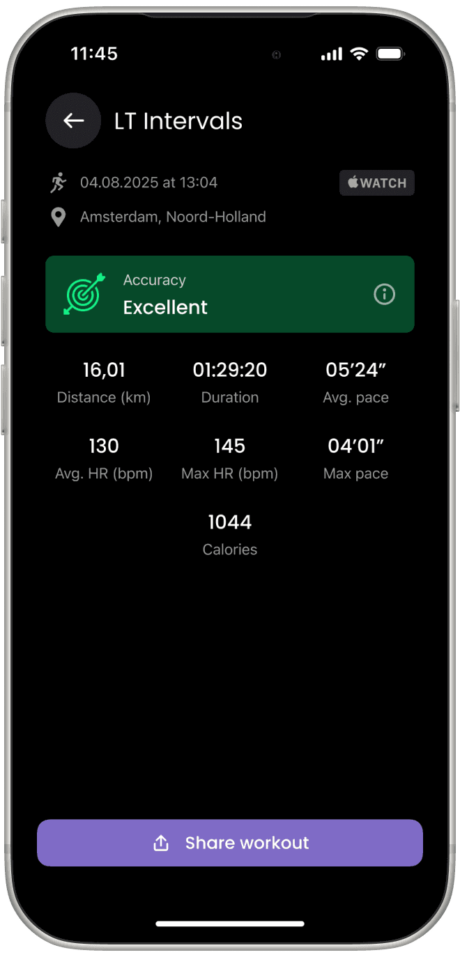
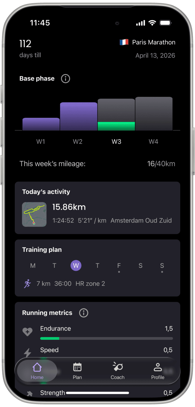
Designed and shipped an iOS & watchOS marathon coaching app that generates a personalized training plan from onboarding inputs and adapts over time. Built key UX workouts, a 24/7 AI coach (Q&A + rescheduling), and a progress dashboard centered on motivation and running fitness dimensions. Evolved the MVP post-launch with onboarding improvements, in-app support entry points, and Apple Watch-focused training features (precision start, haptic cues, autopause).
Boutique marathon experience
Problem: marathon selection is overwhelming in “infinite catalog” directories. First-time marathoners don’t need tens of thousands choices that Ahotu offers, they need confidence and fit. In the era of curated content people want personal recommendations.
Solution: Hiiro’s marathon selection intentionally boutique: it's a curated catalogue of races I personally or my 3 co-founder (all avid runners) can vouch for. A dating apps-inspired mechanic lets users swipe through races and compare the details that matter (entrance fee, travel, route info, elevation gain, weather). Races are relevant to user's location. The list is also safety‑bounded: Hiiro only shows races that allow sufficient prep time (minimum of 12 weeks).
What changed: choosing a marathon becomes part of the product story: fewer choices, more context, and higher commitment. All without the cognitive load of a mega-directory.
#1 beginner failure mode
Problem: effort calibration is the #1 beginner failure. Pace-based plans break the moment conditions change (heat, hills, fatigue). Heart rate ranges are also deeply unique and personal but can also mislead (stress, caffeine, dehydration). Beginners end up either overreaching or undertraining.
Solution: Hiiro is built around RPE (Rate of Perceived Exertion), a simple 1–10 effort scale. It uses clear, human cues (breathing / ability to talk) so runners can self-calibrate without extra gear. RPE makes training portable across terrain and fitness level, while keeping the decision model consistent: “How hard should this feel today?”
“Life happened” shouldn’t derail a 16‑week plan
Problem: static calendars assume perfect adherence. Miss one session and users either enter a guilt-spiral of trying to catch up or abandon the plan completely.
Solution: Hiiro's training plan changes as you progress, miss runs, or need schedule changes. Rescheduling is routed through the AI coach as a guardrail to avoid cluttering of sessions (to keep key sessions spaced safely).
Impact: reduced churn rate after trial period.
-18%
Churn rate
Sharing runs as identity, not data
Problem: Marathon training is identity work. People want to share progress, but many apps produce cluttered “data posters” that feel more like a debug screen than a badge of honor. Sharing progress is vanity-driven, so the artifact must be clean and appealing.
Solution: Hiiro’s sharing flow generates a simple, stylish card: a photo & key stats (distance/time and essentials). I deliberately avoided exposing every metric, unlike ecosystems that emphasize stat-heavy layout (Garmin Connect).
What changed: Sharing became a motivational loop: it’s fast, aesthetically consistent, and optimized for the emotional payoff of marathon preparation.
Cues while running without screen glancing
Problem: during interval running, the runner needs start/end cues now. But Apple Watch screen is glance-limited, fingers are sweaty/slippery, and interaction is constrained by only two hardware buttons (on most models).
Solution: I designed the Apple Watch app around haptics as the primary feedback channel. Depending on the type of interval (warm-up, rest, tempo, cooldown) different recognizable vibration pattern is played in addition to visual on-screen cues.
What changed: intervals became “hands-free”. Distinct vibration patterns allow runners stay in rhythm without constantly staring at their wrist.
Speed interval
Rest / jog
Warm-up / cooldown
Context awareness
Problem: on Apple Watch, interactions are fragile. Accidental taps happen all the time, especially at the start or end of a run. Users can unintentionally start or finish a workout, leading to corrupted data and frustration. Intent isn’t binary, it’s contextual. A tap means different things depending on when it happens.
Solution: I introduced context-aware actions based on workout state.
If a user tries to finish a run within the first minute, the app assume it was likely started by accident and prioritizes “Discard” instead of “Finish"
If a user ends a run after a meaningful duration, the app prioritizes “Finish” as expected
No extra confirmations, no friction — just smarter defaults.
User is stopping the workout after less than a minute of activity? He probably started it by mistake.
Finishing workout after more than several minutes? Show regular finish and save flow.
Safety guardrails
Most running apps optimize for engagement, not outcomes. They’ll happily generate a marathon plan for anyone , regardless of physical readiness, pushing users into injury or failure.

Problem: for first-time marathoners, overconfidence and lack of constraints is the biggest risk factor. The product needs to say “no” when necessary — clearly and without shame.
Solution: introduced hard safety guardrails at onboarding stage. If user's BMI is above a safe threshold the app does not generate a marathon plan. Instead, it explains why, recommends consulting a GP, and suggests lower-impact alternatives (walking, base fitness) before starting a marathon journey.

Peak load
Active days
5
Training time
4-5 hours
Weekly mileage
40-50km
Marathon confidence
Highest
If a user selects less than 3 training days/week, the app states: this is not enough for marathon prep and offer two paths:
Increase training days to proceed with marathon goal.
Keep schedule and continue training, but without race commitment.
The tone is direct but supportive — no gamification, no loopholes.
Outcome:
Prevents unsafe training paths early
Builds trust by prioritizing long-term health over short-term engagement
Positions Hiiro as a coach, not a content generator
Beta
Women’s physiology is not an “edge case” in endurance training
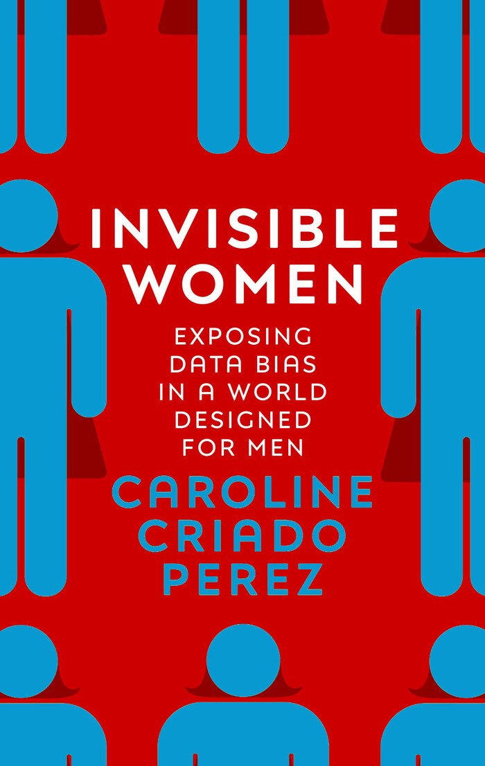
Problem: most fitness apps are designed around male body, it's what Caroline Criado Perez calls "default male". For many women, training readiness and perceived effort can vary across the menstrual cycle; ignoring that can reduce trust and increase friction.
Solution: we introduced cycle-aware feature by supporting period tracking inputs via Flow and Apple's HealthKit. Depending on the phase of a cycle, plan reduces mileage, intensity, or pauses completely.
What changed: women getting into running feel included and not forgotten by yet another fitness app revolved around body that doesn't experience any hormonal change throughout the month.
* by the time of writing this, feature shipped internally.
My tabletop book about design
Tools


Lessons learned
Constraints create clarity
The safest marathon plan is not the most flexible one. It’s the one that helps you change the schedule without breaking recovery structure.
Watch UX isn’t “mini iPhone”
Motion, blur, sweat and limited hardware turn haptics and crown-friendly navigation into primary design tools, not nice-to-haves.
Motivation needs artifacts
A clean share card isn’t cosmetic, it’s behavior design. People training for a marathon want proof of progress that looks good enough to post.

Ready to build something amazing together?
I'd love to connect with you.