Semrush UI redesign
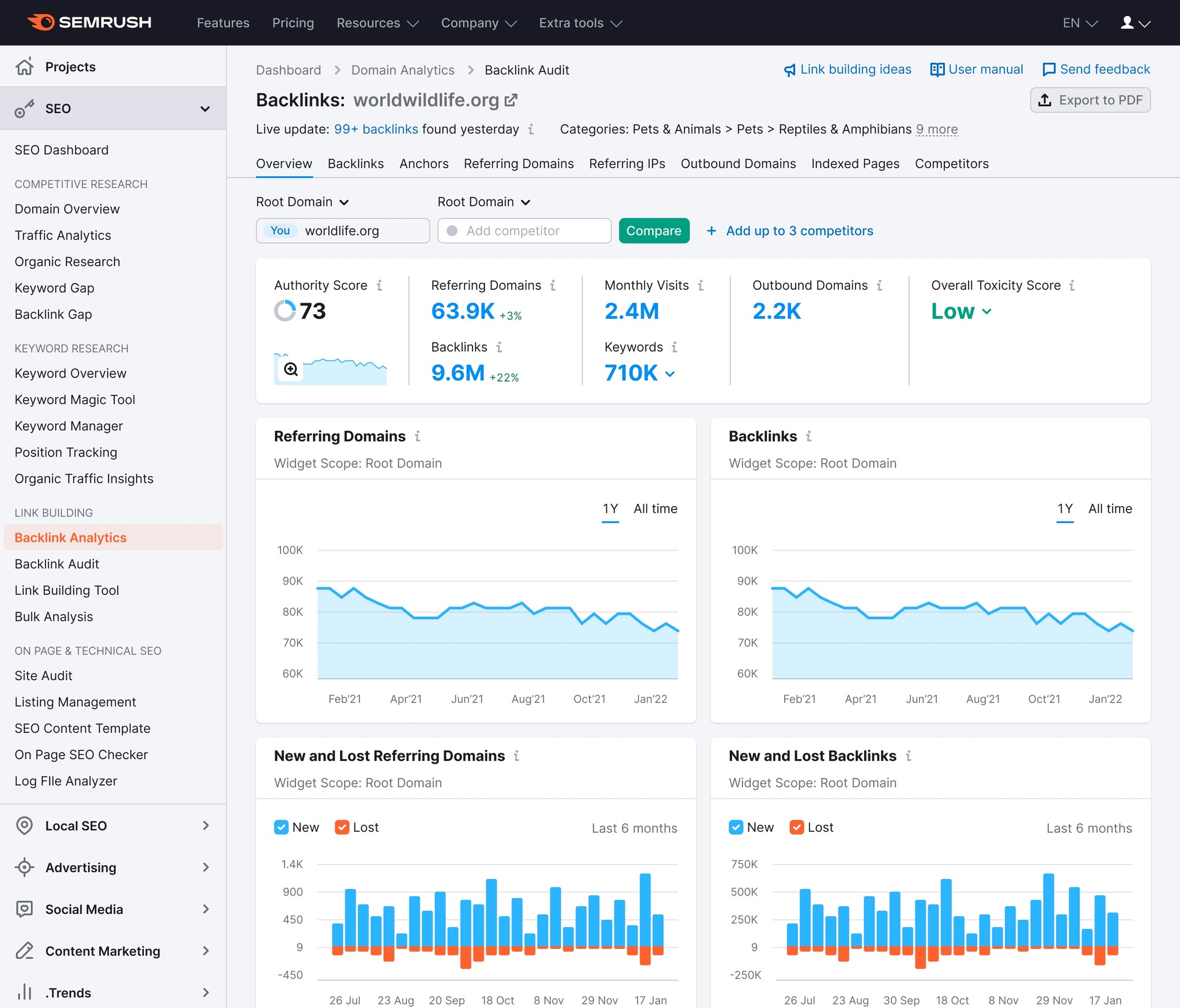
Semrush’s interface hasn't received any major update for many years now. Some reports go as far as 2015. In 2021, Semrush brand got a new visual language that includes logo, font and a tone of voice. It started to be clearer that brand visuals and existing interface have a noticeable incoherence between them. A time has come to give Semrush interface a major overhaul.
Hover on image to see before and after
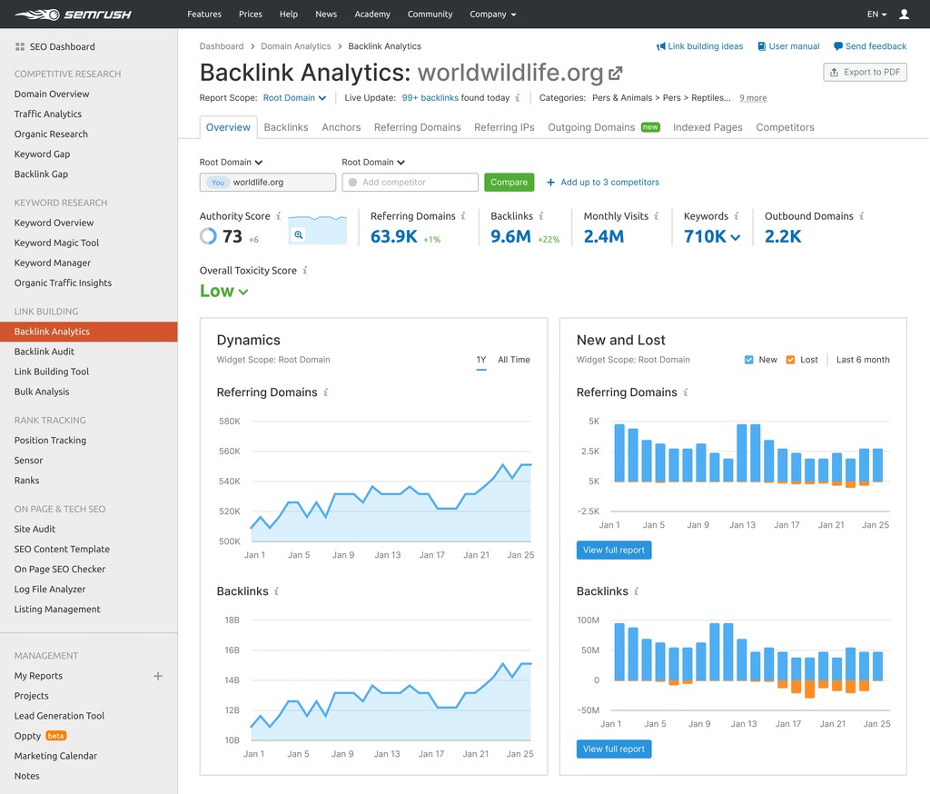
Before
Research
Before starting out I conducted a big research of other major restylings, redesigns and design system refreshments. What I've found it is that when it comes to digital products, especially 2b2 or b2c with established audiences, users tend to be very protective about the existing look of familiar environments, and not very welcoming to new things. Redesigns usually are greeted with a shitstorm of unknown magnitudes.
My approach was to play it safe. In order not to damage the existing patterns, metrics, flows and funnels, I decided to avoid any UX changes, moving any buttons or revamping any pages.
Experimentation
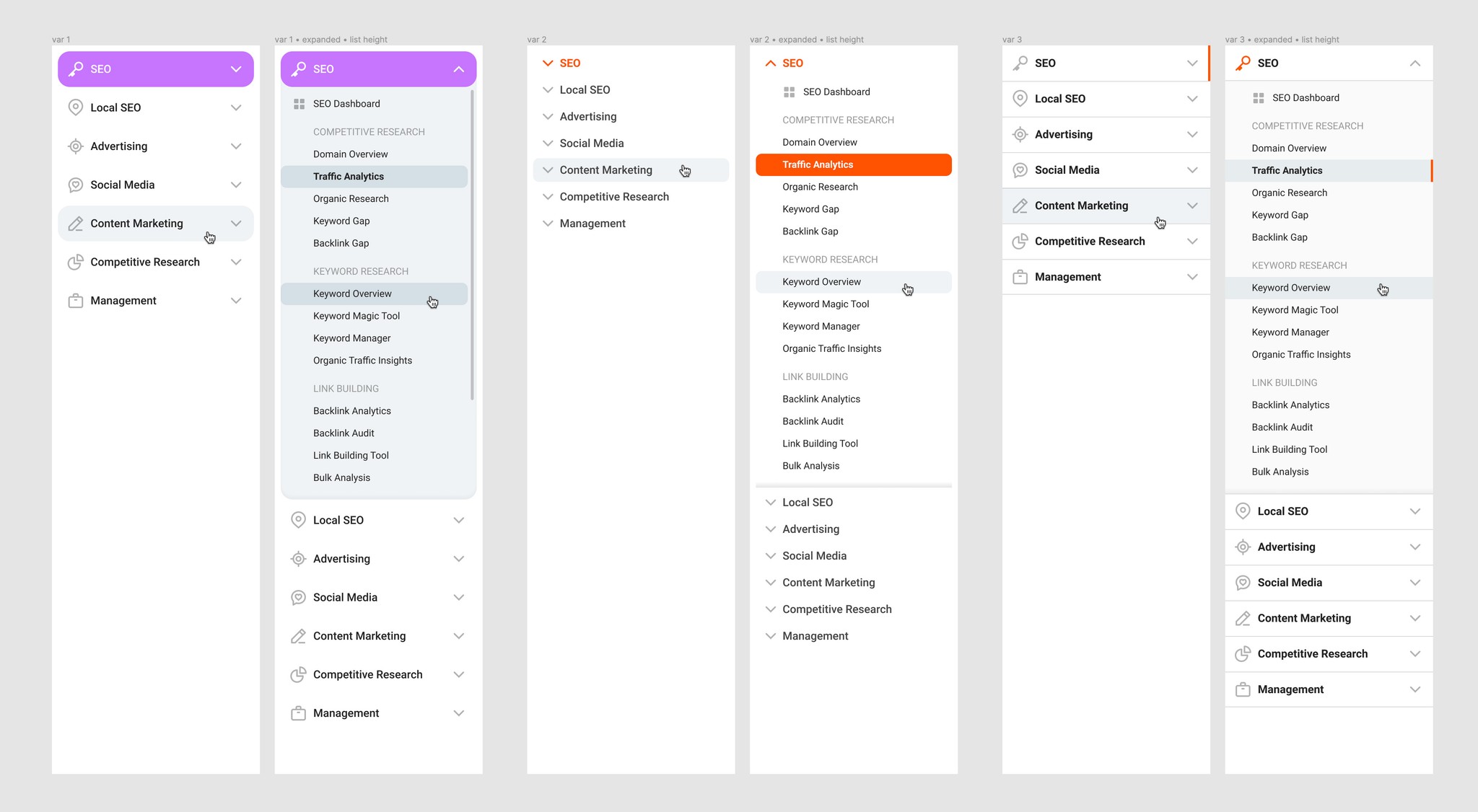
A search for the right style was long and steep. Experimentation took a lot of time and effort. Luckily, I had a lot of time at hand and other designers within arm's reach.
Icons and likings
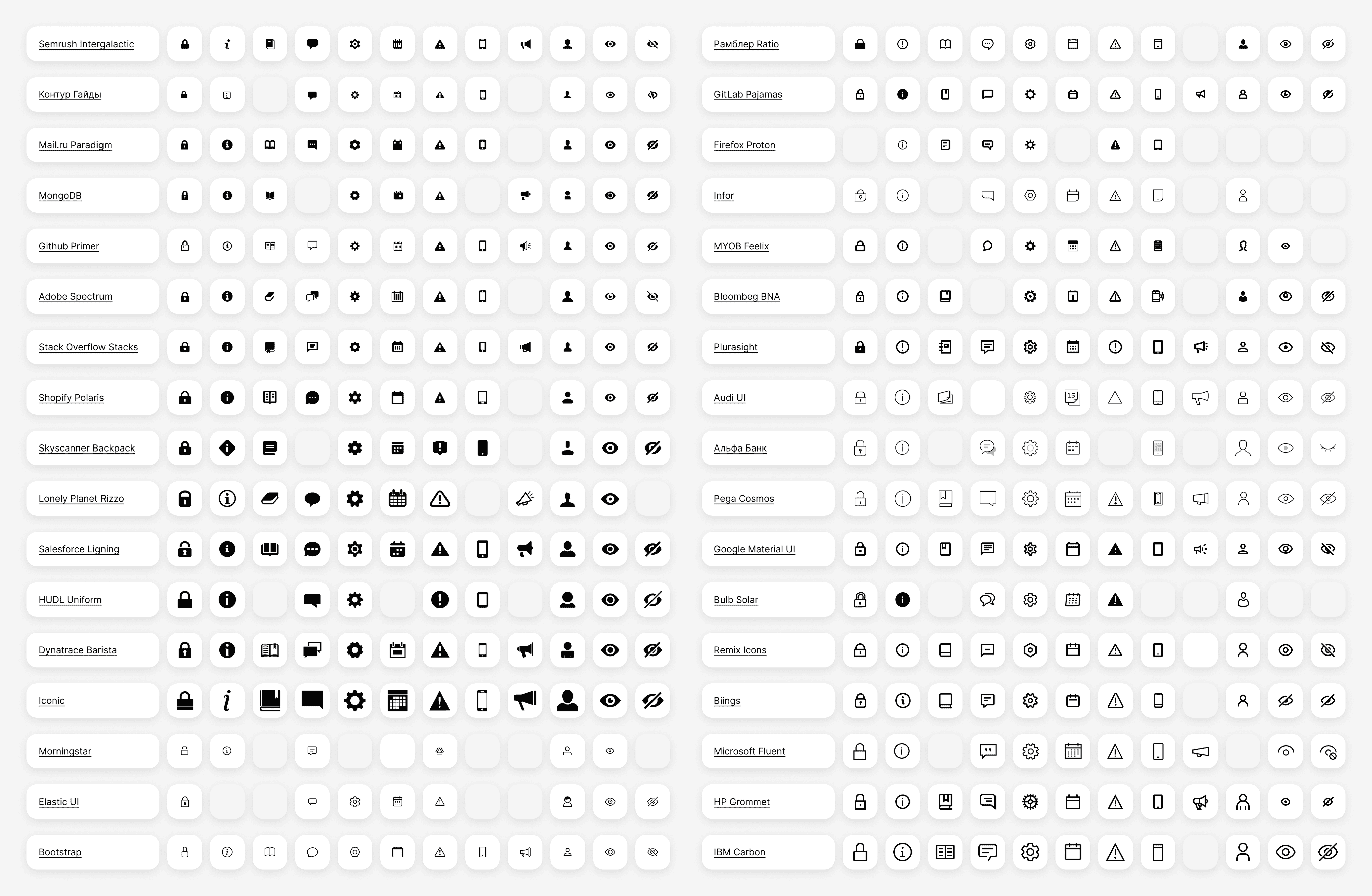
To find a right mood and tone for the new icons I've inspected 34 icon sets from different design systems. I've distributed them by style (outlined or filled), thickness, decorative elements (simple or detailed), etc.
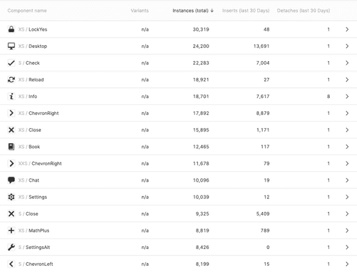
To reduce Semrush's ostentatious size of icon set and conducted a research of existing ones. There were 328 unique icons in 3 sizes each, some even go up to 5 sizes. Having created most of them by myself, I know for sure that recreating each one would be a tedious task. Luckily, my approach was data-driven.
With the help of Figma's Component statistics I could see exactly how many of these icons are being used, how often, which are often detached from their master-symbol, etc. I could also find the ones that are interchangeable.
I've reduced the quantity of unique icons to 292 and limited their size variants to only two.
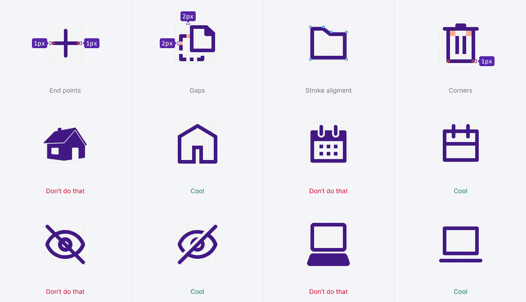
New icons now look coherent and unified, sharing the same border width for both sizes, identical rounded corner radiuses and other stylistic elements.
Apart/together
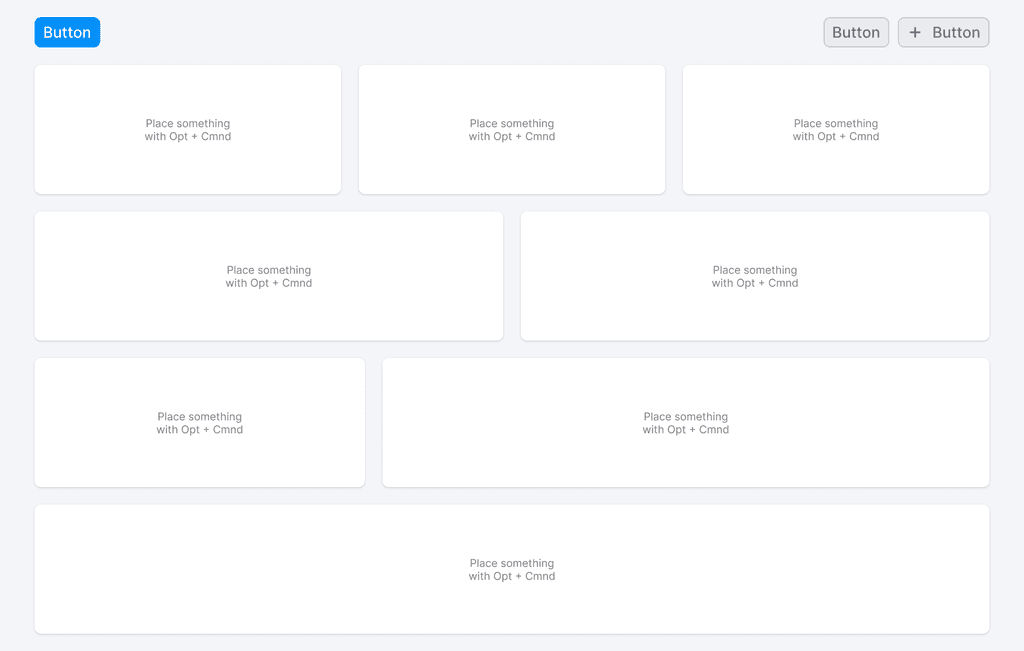
While auditing layouts of Semrush products, I’ve found 16 different variants for screen sizes and even more for media queries, breakpoints for various devices including tablets and phones.
I've offer a solution to that, modular grid, a system that came into web design from typography. It’s a layout that involves positioning content into individual, equally sized modules that sit together within a grid. Each module stack neatly on top of the other, and sit horizontally next to the other, to create a consistent design pattern. The grid has 12 columns making it easier to create combinations both even and odd. Columns can be predictably rearranged and adjusted to different screen sizes accordingly. Gutters, gaps between columns and rows stay the same.
It also matches the idea of keeping apart those logical increments that don't interconnect and stacking together those that do and/or affect each other. Principle works great on different Semrush reports that have a lot of white space, while others are very dense and air-deprived.
Accessibility and futureproofing
I wanted to make the interface usable for people with disabilities, the largest minority in the world. My aim was to meet the medium level, AA compliance of WCAG (Web Content Accessibility Guidelines).
Contrast checker, is a key tool to achieve that compliance. It allows you to see whether or not your shape colors or text colors are passing necessary thresholds ensuring you can see what your designs look like for individuals with all types of colorblindness, low-vision, and more.
But, I've set the aim even higher, complying with APCA, Advanced Perceptual Contrast Algorithm, which is a WCAG version 3 working draft for newer contrast checker guidelines. It means that when version 3 is released, Semrush already would be complying to that specification.
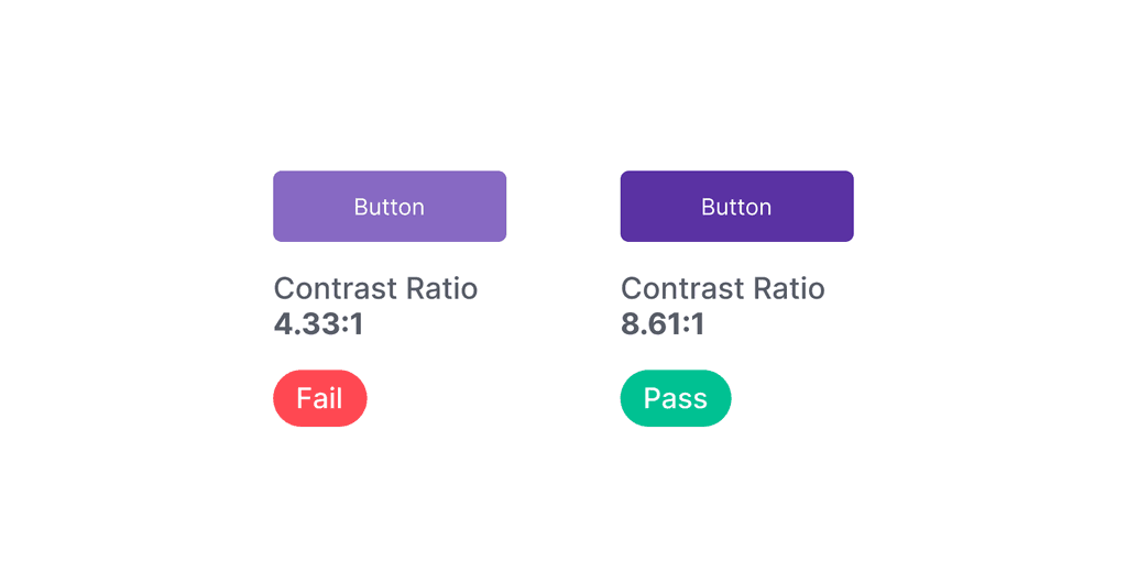
To avoid manual tweaking and darkening I've adopted a more advanced Lab color model instead of conventional HSL (Hue, Saturation, Lightness). This also helped to keep clear and vibrant hues instead of dull or muted color.
Lab model is perceptually uniform, which allows WCAG success criteria to be met. After a lot of iterations I arrived at a palette of colors that achieved our goals: colors predictably passed accessibility guidelines and maintained a consistent visual weight across them.
Visual loudness
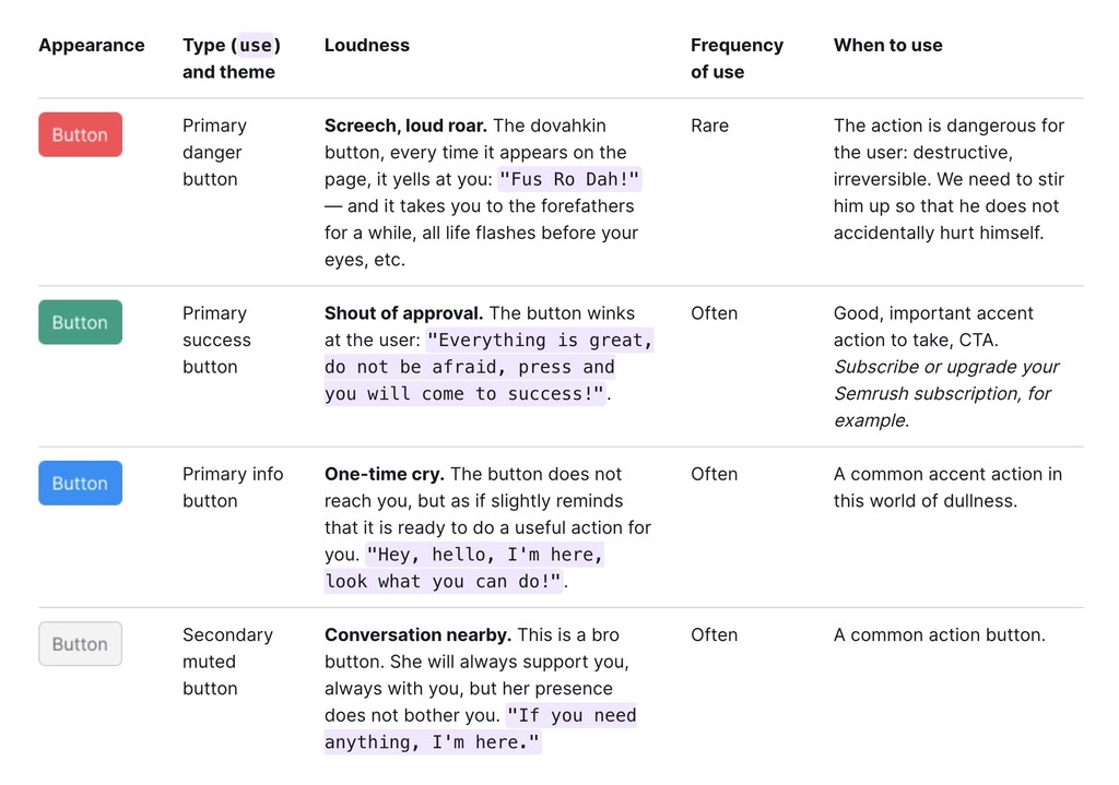
Visual loudness scale is a method of building the visual hierarchy. Thoughtful and selective use of color will always give better results as wayfinding guideposts. For example, a red button is loud, screeching and informs of dangerous, destructive and irreversible action. While the green button is a shout of approval, portraying a good, important call to action. And a secondary muted button is a conversation nearby, a display for common action, saying “Hey, I’m here, if you need me”. This scale helps to put focus on necessary things on a page. This way you can increase the volume of important elements and lower the volume of all else.
Tight corners
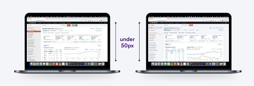
Overall the interface has grown larger. The body font grown from 12px to 14px. Buttons, inputs and other components also become bigger. Space between components — too. Yet, none of that hurt vertical screen real estate.
If we compare two interfaces — the old one and the new one by putting them side by side, on a conventional 13 inch laptop, adding menu bar, browser window and a dock, the difference on the fold, an area of the webpage, visible to the user before he starts to scroll, would be under 50 pixels.
Making designers' life easier
Aside from UI changes, I also wanted to make it easier for designers to work with new system.
Every component became Auto-layout based. If you’re a developer, think of a Flexbox inside a graphic editor. If not, of superb components that can grow to fill or shrink to fit, and reflow as their contents change. This is great when you need to accommodate longer text strings, or maintain alignment as your designs evolve.
Variants helped to build complex components while at the same time making them less bloated and thus, keeping files lighter and speeding up the work. They also allowed me to get consistent naming and semantics across code and design.
Did it work?
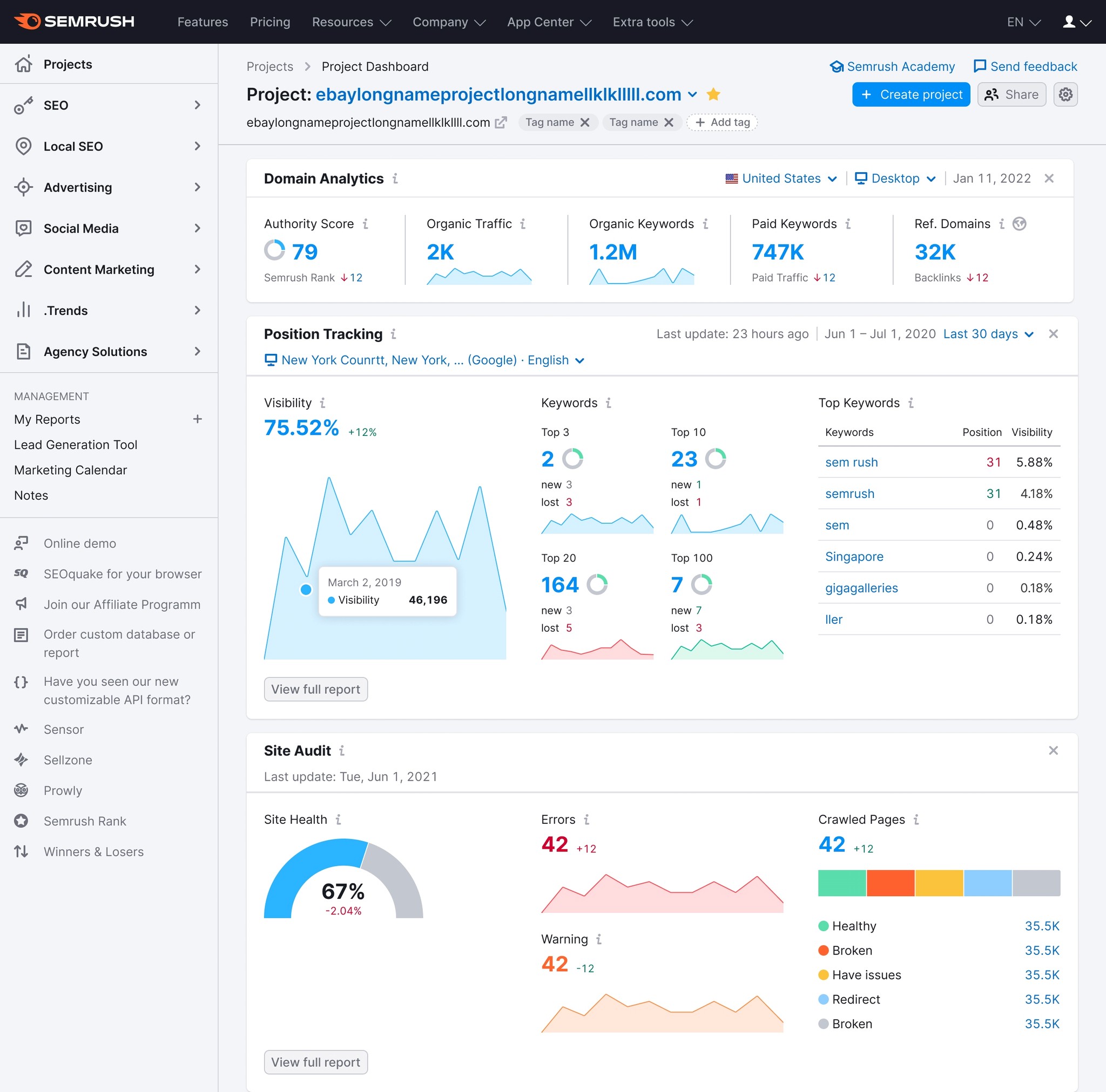
It worked. UX team conducted a big research, putting our decisions to test. The results was shockingly good — new design receivied a lot of positive feedback.
Semrush UI redesign
Semrush’s interface hasn't received any major update for many years now. Some reports go as far as 2015. In 2021, Semrush brand got a new visual language that includes logo, font and a tone of voice. It started to be clearer that brand visuals and existing interface have a noticeable incoherence between them. A time has come to give Semrush interface a major overhaul.
Hover on image to see before and after

Before

Research
Before starting out I conducted a big research of other major restylings, redesigns and design system refreshments. What I've found it is that when it comes to digital products, especially 2b2 or b2c with established audiences, users tend to be very protective about the existing look of familiar environments, and not very welcoming to new things. Redesigns usually are greeted with a shitstorm of unknown magnitudes.
My approach was to play it safe. In order not to damage the existing patterns, metrics, flows and funnels, I decided to avoid any UX changes, moving any buttons or revamping any pages.
Experimentation

A search for the right style was long and steep. Experimentation took a lot of time and effort. Luckily, I had a lot of time at hand and other designers within arm's reach.
Icons and likings

To find a right mood and tone for the new icons I've inspected 34 icon sets from different design systems. I've distributed them by style (outlined or filled), thickness, decorative elements (simple or detailed), etc.

To reduce Semrush's ostentatious size of icon set and conducted a research of existing ones. There were 328 unique icons in 3 sizes each, some even go up to 5 sizes. Having created most of them by myself, I know for sure that recreating each one would be a tedious task. Luckily, my approach was data-driven.
With the help of Figma's Component statistics I could see exactly how many of these icons are being used, how often, which are often detached from their master-symbol, etc. I could also find the ones that are interchangeable.
I've reduced the quantity of unique icons to 292 and limited their size variants to only two.

New icons now look coherent and unified, sharing the same border width for both sizes, identical rounded corner radiuses and other stylistic elements.
Apart/together

While auditing layouts of Semrush products, I’ve found 16 different variants for screen sizes and even more for media queries, breakpoints for various devices including tablets and phones.
I've offer a solution to that, modular grid, a system that came into web design from typography. It’s a layout that involves positioning content into individual, equally sized modules that sit together within a grid. Each module stack neatly on top of the other, and sit horizontally next to the other, to create a consistent design pattern. The grid has 12 columns making it easier to create combinations both even and odd. Columns can be predictably rearranged and adjusted to different screen sizes accordingly. Gutters, gaps between columns and rows stay the same.
It also matches the idea of keeping apart those logical increments that don't interconnect and stacking together those that do and/or affect each other. Principle works great on different Semrush reports that have a lot of white space, while others are very dense and air-deprived.
Accessibility and futureproofing
I wanted to make the interface usable for people with disabilities, the largest minority in the world. My aim was to meet the medium level, AA compliance of WCAG (Web Content Accessibility Guidelines).
Contrast checker, is a key tool to achieve that compliance. It allows you to see whether or not your shape colors or text colors are passing necessary thresholds ensuring you can see what your designs look like for individuals with all types of colorblindness, low-vision, and more.
But, I've set the aim even higher, complying with APCA, Advanced Perceptual Contrast Algorithm, which is a WCAG version 3 working draft for newer contrast checker guidelines. It means that when version 3 is released, Semrush already would be complying to that specification.

To avoid manual tweaking and darkening I've adopted a more advanced Lab color model instead of conventional HSL (Hue, Saturation, Lightness). This also helped to keep clear and vibrant hues instead of dull or muted color.
Lab model is perceptually uniform, which allows WCAG success criteria to be met. After a lot of iterations I arrived at a palette of colors that achieved our goals: colors predictably passed accessibility guidelines and maintained a consistent visual weight across them.
Visual loudness

Visual loudness scale is a method of building the visual hierarchy. Thoughtful and selective use of color will always give better results as wayfinding guideposts. For example, a red button is loud, screeching and informs of dangerous, destructive and irreversible action. While the green button is a shout of approval, portraying a good, important call to action. And a secondary muted button is a conversation nearby, a display for common action, saying “Hey, I’m here, if you need me”. This scale helps to put focus on necessary things on a page. This way you can increase the volume of important elements and lower the volume of all else.
Tight corners

Overall the interface has grown larger. The body font grown from 12px to 14px. Buttons, inputs and other components also become bigger. Space between components — too. Yet, none of that hurt vertical screen real estate.
If we compare two interfaces — the old one and the new one by putting them side by side, on a conventional 13 inch laptop, adding menu bar, browser window and a dock, the difference on the fold, an area of the webpage, visible to the user before he starts to scroll, would be under 50 pixels.
Making designers' life easier
Aside from UI changes, I also wanted to make it easier for designers to work with new system.
Every component became Auto-layout based. If you’re a developer, think of a Flexbox inside a graphic editor. If not, of superb components that can grow to fill or shrink to fit, and reflow as their contents change. This is great when you need to accommodate longer text strings, or maintain alignment as your designs evolve.
Variants helped to build complex components while at the same time making them less bloated and thus, keeping files lighter and speeding up the work. They also allowed me to get consistent naming and semantics across code and design.
Did it work?

It worked. UX team conducted a big research, putting our decisions to test. The results was shockingly good — new design receivied a lot of positive feedback.